

An illustrative example, not an actual client: a mom finishes a workout class and checks her phone before she’s even grabbed her water bottle. She searches “kids martial arts near me.” She taps your site. The homepage takes a few seconds to load. The class schedule is a PDF she has to pinch and zoom to read. She gives up and taps the next result instead.
This is how people search for a gym, martial arts school, or studio now. On a phone, in a spare minute, between sets or between picking up one kid and dropping off another.
Is My Gym’s Website Built for Mobile?
If your website was built for a desktop screen and shrunk down to fit a phone, it’s probably harder to use than it should be. Buttons that are easy to click with a mouse are hard to tap with a thumb. Text that’s readable at a desk is too small to read one-handed. A class schedule that makes sense as a table on a laptop turns into an unreadable grid on a phone.
None of this shows up if you’re checking your own site on your own laptop, at your desk. It shows up the moment a prospective member tries to sign up from their phone, which is where most of them are.
Why Speed Matters on Mobile
A fast, easy mobile site wins you leads. Someone searching for a gym or a martial arts school on their phone is already comparing you to two or three other results in the same search. If your site is slow to load or hard to use, they don’t wait around to figure it out. They move to the next tab.
Every one of those exits is a person who was ready to ask about a trial class or pricing, and left before they got the chance.
The Sign-Up Button Should Be the Easiest Thing to Tap
If someone has to hunt for how to book a trial class or reach your front desk, you’ve already lost them. Your primary call to action, whether that’s “Book a Free Class” or “Start Your Trial,” needs to sit near the top of the page and stay easy to tap with one thumb, not buried under a menu or shrunk down next to five other links.
Your Class Schedule Needs to Load Fast
Parents and members check your schedule constantly, usually while they’re already halfway out the door. If your schedule is a scanned PDF, an embedded spreadsheet, or anything that takes more than a couple of taps to read, you’re asking a busy parent to work for information they need in ten seconds.
Contact Forms That Actually Work on a Phone
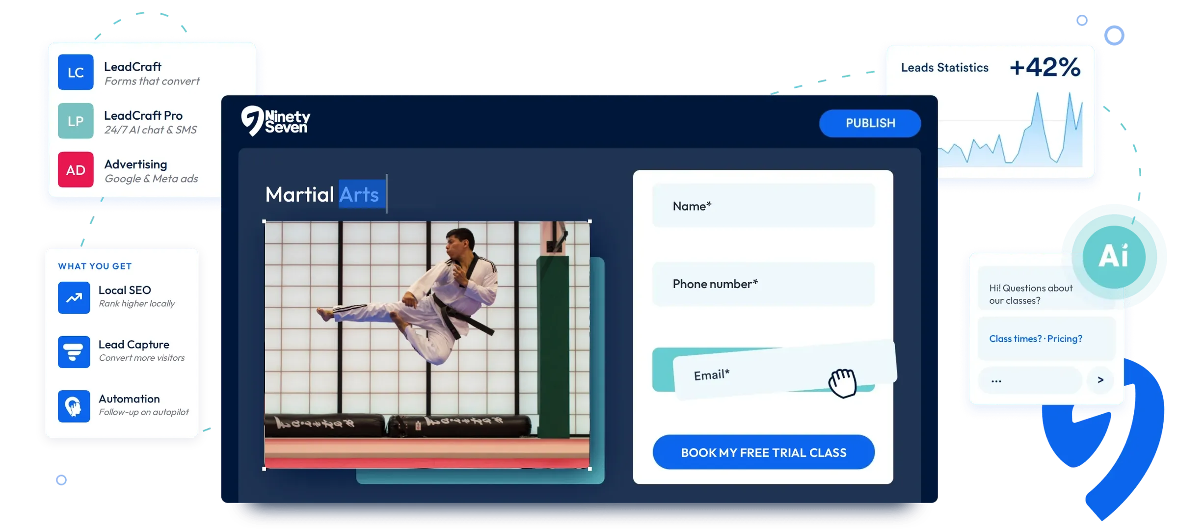
A contact form with ten fields is hard enough to fill out on a laptop. On a phone, with autocorrect fighting you the whole way, it’s worse. Keep the form short: name, phone number, and what they’re interested in. Anything beyond that can wait for the follow-up call.
Want a quick way to check the rest of your site too? Grab our free Lead-Generating Website Checklist.
Test Your Site the Way Your Members Actually Use It
Open your website on your phone, one-handed, and try to book a class the way a new lead would, not at your desk or on a tablet next to your laptop. If you find yourself pinching to zoom or hunting for the sign-up button, a prospective member found the same thing right before they left for a competitor’s site.
Every LeadCraft website is built mobile-first, with fast-loading pages, thumb-friendly buttons, and short lead forms that work on a phone. Get started and our team will be in touch to answer your questions.